
Why we ask for Pantone colours
To get exactly the right colour on your label – every time – we ask you to specify key colours as Pantone. This applies to your logo, brand colours and larger solid areas. Here is why, and how Pantone, CMYK, RGB and HEX differ.
IN SHORT
- Pantone is a premixed printing ink – exact and measurable. Use it for logos and brand colours.
- CMYK is a recipe of four inks that varies with material and press. Perfect for photos and images.
- RGB and HEX are screen colours. They cannot serve as a reference for print.
1. Pantone gives an exact, measurable colour
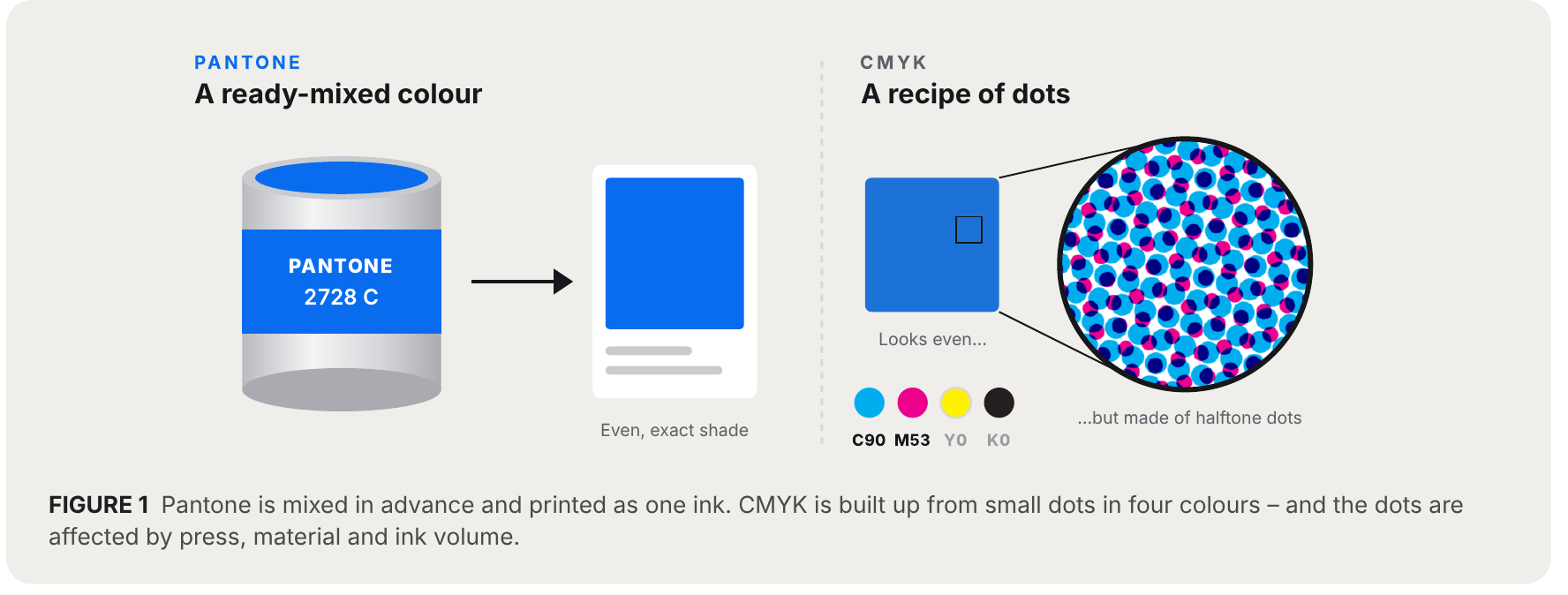
A Pantone colour is mixed in advance to a defined shade and printed as one ink. We can compare it against a physical colour guide, so both you and we know exactly what the result should be. The colour stays the same from print run to print run – and if anything deviates, there is a clear reference to measure against.
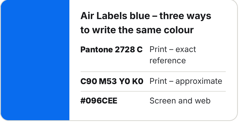
Take our own blue as an example. The same colour can be written in three ways – but only one of them is an exact reference in print:
2. CMYK varies
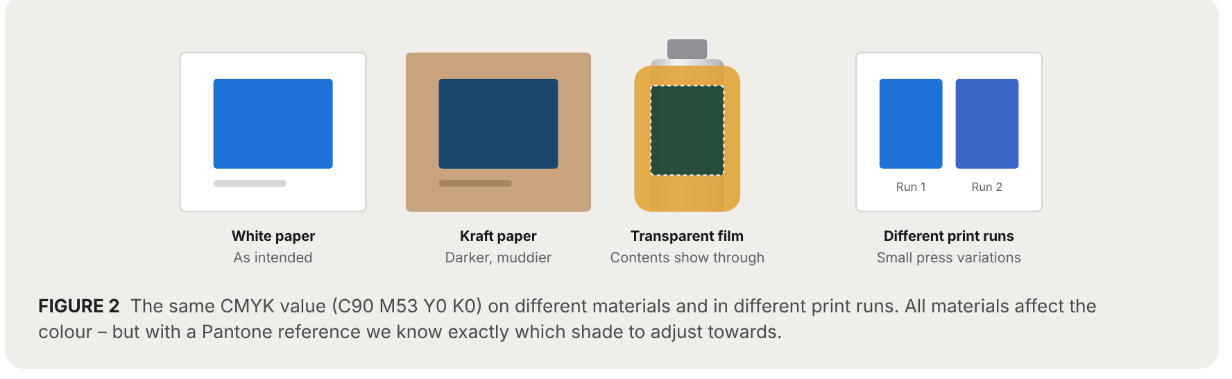
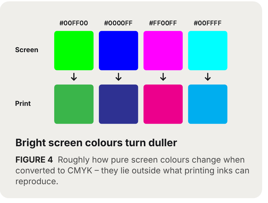
CMYK is not a finished colour but a recipe. The resulting shade depends on printing method, material and press – the same CMYK value can look different on different materials or in different print runs. Some colours cannot be reached in CMYK at all, such as strong orange, vivid greens and blues, neon and metallic.
CMYK works perfectly for photos and images, but less well for colours that must be exact.
3. RGB and HEX are screen colours – not print colours
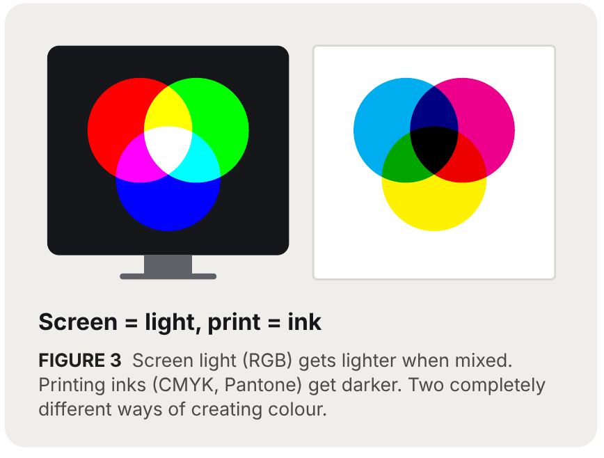
RGB and HEX describe how a colour looks when it shines on a screen. HEX is simply another way of writing an RGB value, for example #096CEE. A screen creates colour with light – print creates colour with ink on paper or film. That is why:
- Many screen colours, especially bright and luminous tones, cannot be printed. They turn duller on the label.
- When RGB or HEX is converted to print colours, the result differs depending on software and settings.
- The same HEX code looks different on different screens, so there is no reliable reference to match against.

Colour codes at a glance
| Code | What it is | Best for | Exact in print? |
|---|---|---|---|
| Pantone | Premixed printing ink with a number, e.g. 2728 C | Logos, brand colours, solid areas | ● Yes |
| CMYK | Four printing inks that build the shade from dots | Photos, images and gradients | ● Varies |
| RGB | The screen’s light colours: red, green and blue | Web, screen, film | ● No |
| HEX | An RGB value written as code, e.g. #096CEE | Web and digital files | ● No |
Our recommendation
- Specify logos and brand colours as Pantone, for example “Pantone 286 C”.
- Keep photos and images in CMYK.
- Not sure which Pantone colour matches yours? Contact us and we will help you find the closest match.
Frequently asked questions
What is the difference between Pantone and CMYK?
Pantone is a premixed ink that is printed as one colour and can be measured against a physical colour guide. CMYK builds the shade from dots in four inks, and the result is affected by material, press and ink volume.
Can I send HEX or RGB codes for print?
They can be converted, but the result varies between software and settings, and bright screen colours turn duller in print. For colours that must be exact, specify Pantone.
Should photos and images be in Pantone too?
No. Photos, images and gradients should be in CMYK. Pantone is used for logos, brand colours and larger solid areas.
The colour samples shown are illustrations and may differ from actual printed colour.

Leave a Reply
Want to join the discussion?Feel free to contribute!